Control where thumbnails appear and how they look. These settings are part of the PRO 3D plan.
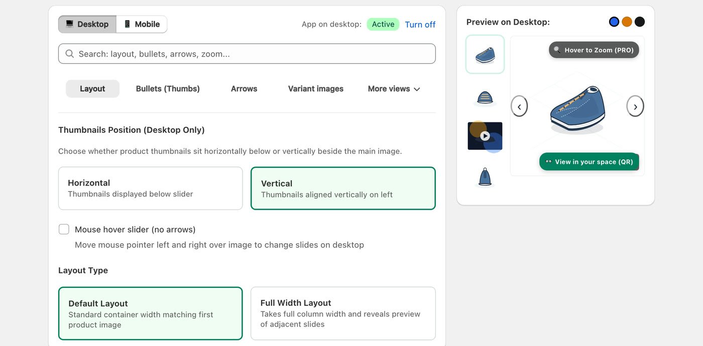
Layout Tab
- Thumbnails Position (Desktop Only) — Horizontal places thumbnails below the main image; Vertical aligns them on the left. On mobile, thumbnails always sit below the image.
- Mouse hover slider (no arrows) — on desktop, shoppers move the mouse left and right over the image to change slides.
- Layout Type — Default Layout matches the width of your first product image; Full Width Layout uses the full column width and shows a preview of the neighboring slides.
Bullets (Thumbs) Tab
- Thumbnail Shape — Rounded Corner, Pill Oval or Square.
- Thumbnail Size (px) — from 40px to 80px.
- Active Thumbnail Border Color — the highlight color of the selected thumbnail.